How I Let the Light In
Natasha Oslinger
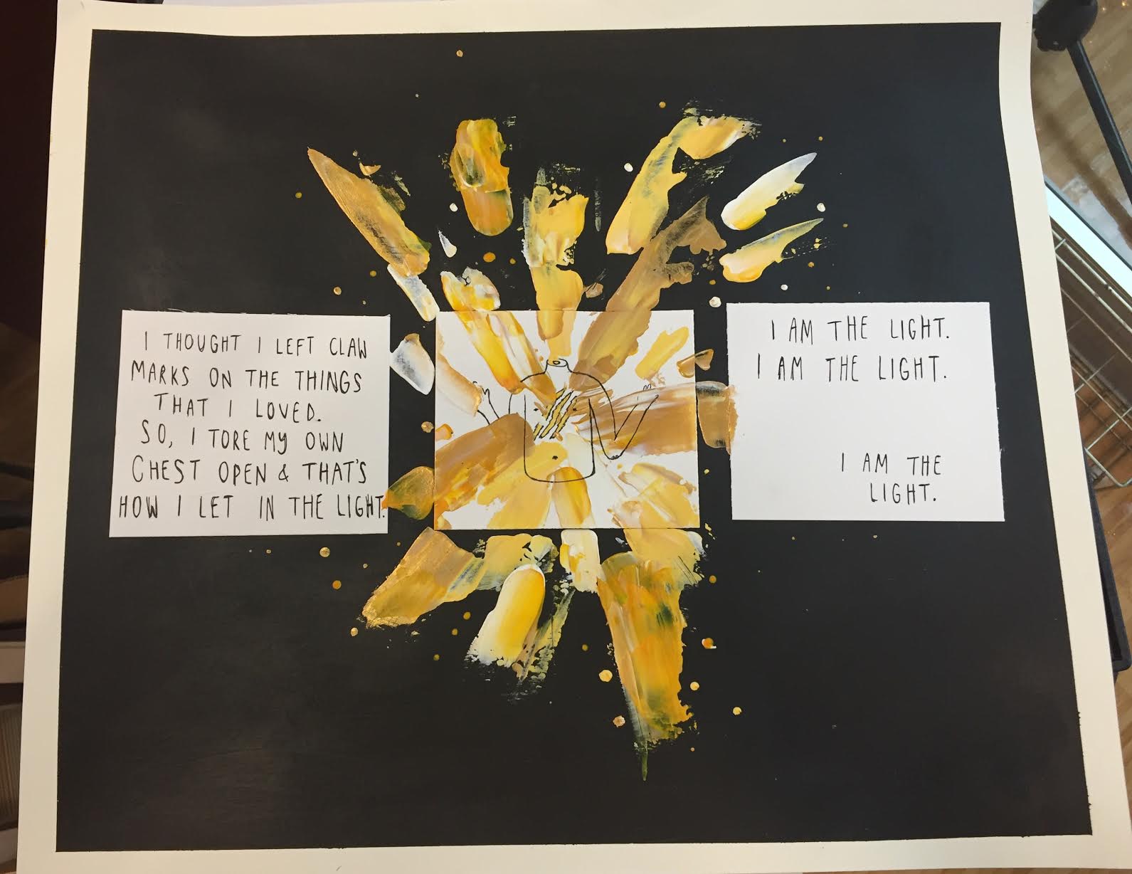
This is the feeling of claws dragged across the chest, this is the feeling of a violent glowing golden hue shining out. Although my art concentration is focused mostly on negative emotions, I thought for this one I would express the calm after the storm. To make this piece I started with a sketch of my ideas and receive critique from my peers on how I can improve my work. After I solidified my idea, I cut a piece of thick paper to be my desired size, then cut three smaller papers of equal proportion. After covering the edges of the larger paper in blue tape to ensure it would remain white, I used very thick black acrylic paint to cover it in its entirety. I wanted to use a thick black paint rather than one that would be easy to spread because I wanted the background to have a sort of streaky texture. After the paint dried, I used hot glue to paste down the three white squares so that they were centered, then I started on my design. I began by writing phrases with pencil on the left and right squares then going over them with .5 size copic pen. The penmanship is purposefully messy and drawn without a straight edge because I wanted to words to add to the ethereal kind of disposition of the piece. After doing the lettering, I moved onto the main component in the middle. I started with sketching a simple outline of a torso with three claw marks in pen, then I made different shades of yellow with ochre, gold, and white paint. I wanted to give the effect of light shining out of the claw marks on the chest, so, I used a palette knife to put thick streaks of paint creeping out. My greatest struggle in this project was that I didn’t actually have a palette knife, so, I had to use a plastic butter knife from my kitchen. I feel the final product would have been better better if I would have had aquired the correct materials, but, overall, I am proud of the final product and how it turned out.
Natasha Oslinger
This is the feeling of claws dragged across the chest, this is the feeling of a violent glowing golden hue shining out. Although my art concentration is focused mostly on negative emotions, I thought for this one I would express the calm after the storm. To make this piece I started with a sketch of my ideas and receive critique from my peers on how I can improve my work. After I solidified my idea, I cut a piece of thick paper to be my desired size, then cut three smaller papers of equal proportion. After covering the edges of the larger paper in blue tape to ensure it would remain white, I used very thick black acrylic paint to cover it in its entirety. I wanted to use a thick black paint rather than one that would be easy to spread because I wanted the background to have a sort of streaky texture. After the paint dried, I used hot glue to paste down the three white squares so that they were centered, then I started on my design. I began by writing phrases with pencil on the left and right squares then going over them with .5 size copic pen. The penmanship is purposefully messy and drawn without a straight edge because I wanted to words to add to the ethereal kind of disposition of the piece. After doing the lettering, I moved onto the main component in the middle. I started with sketching a simple outline of a torso with three claw marks in pen, then I made different shades of yellow with ochre, gold, and white paint. I wanted to give the effect of light shining out of the claw marks on the chest, so, I used a palette knife to put thick streaks of paint creeping out. My greatest struggle in this project was that I didn’t actually have a palette knife, so, I had to use a plastic butter knife from my kitchen. I feel the final product would have been better better if I would have had aquired the correct materials, but, overall, I am proud of the final product and how it turned out.